Noetic Bootcamp helps people move from learning a skill to actually getting paid for it. That is a hard promise to make online. Visitors show up skeptical, compare you to a dozen other programs, and leave if the site feels vague or cheap.
They needed a site that answers the real questions quickly: what is this, who is it for, and why should I trust you with my career pivot?
What I built
I built the marketing site on Astro with Tailwind and Bootstrap where it made sense — fast pages, clear hierarchy, and layouts that hold up on phones because a lot of traffic is not sitting at a desk.
Cloudflare sits in front for delivery and security. The goal was not flashy motion. It was a site that loads fast, reads clearly, and nudges people toward the next step without feeling desperate.
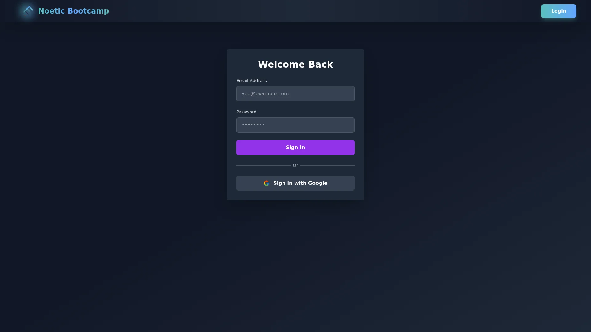
How the site is structured
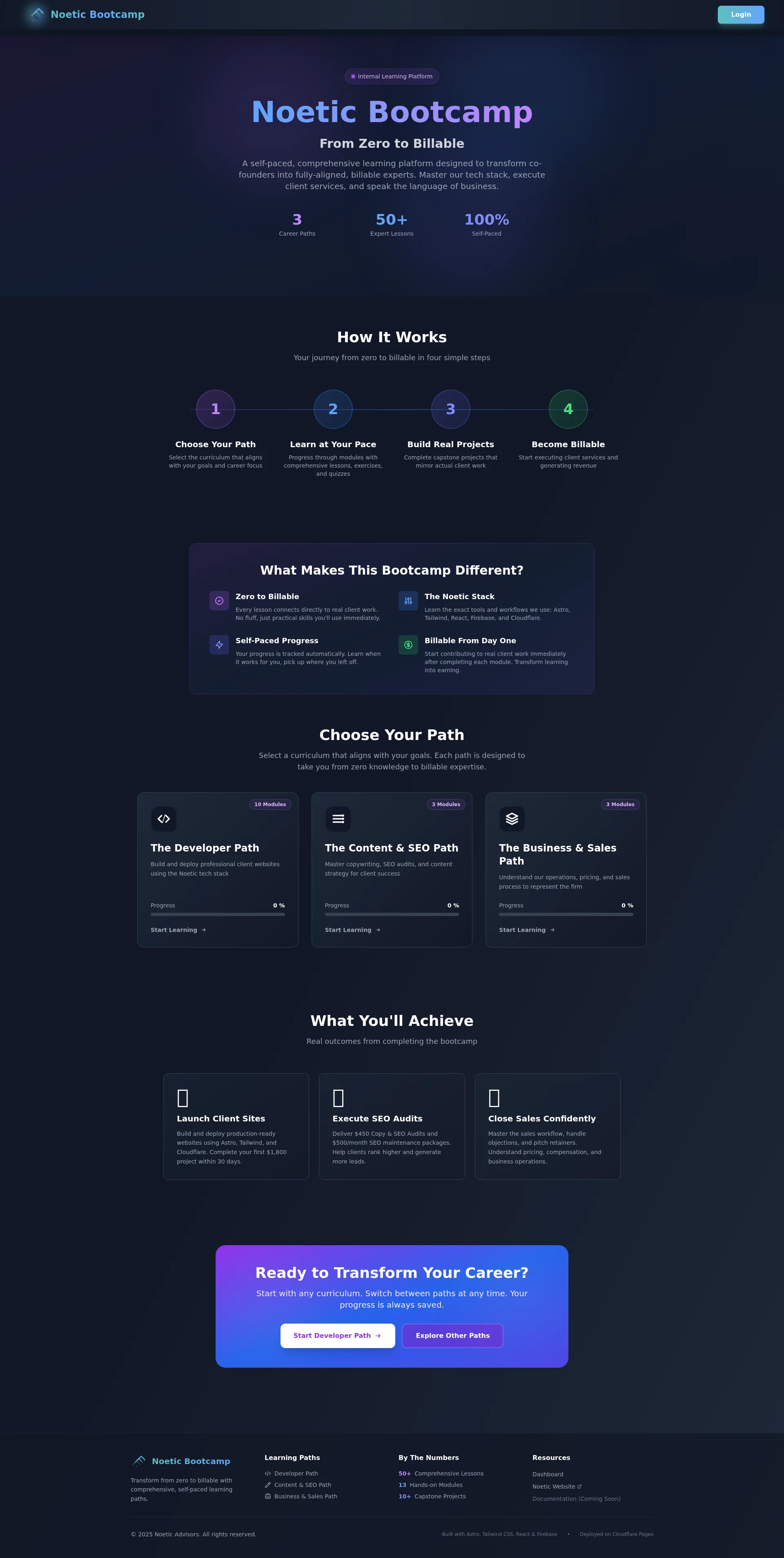
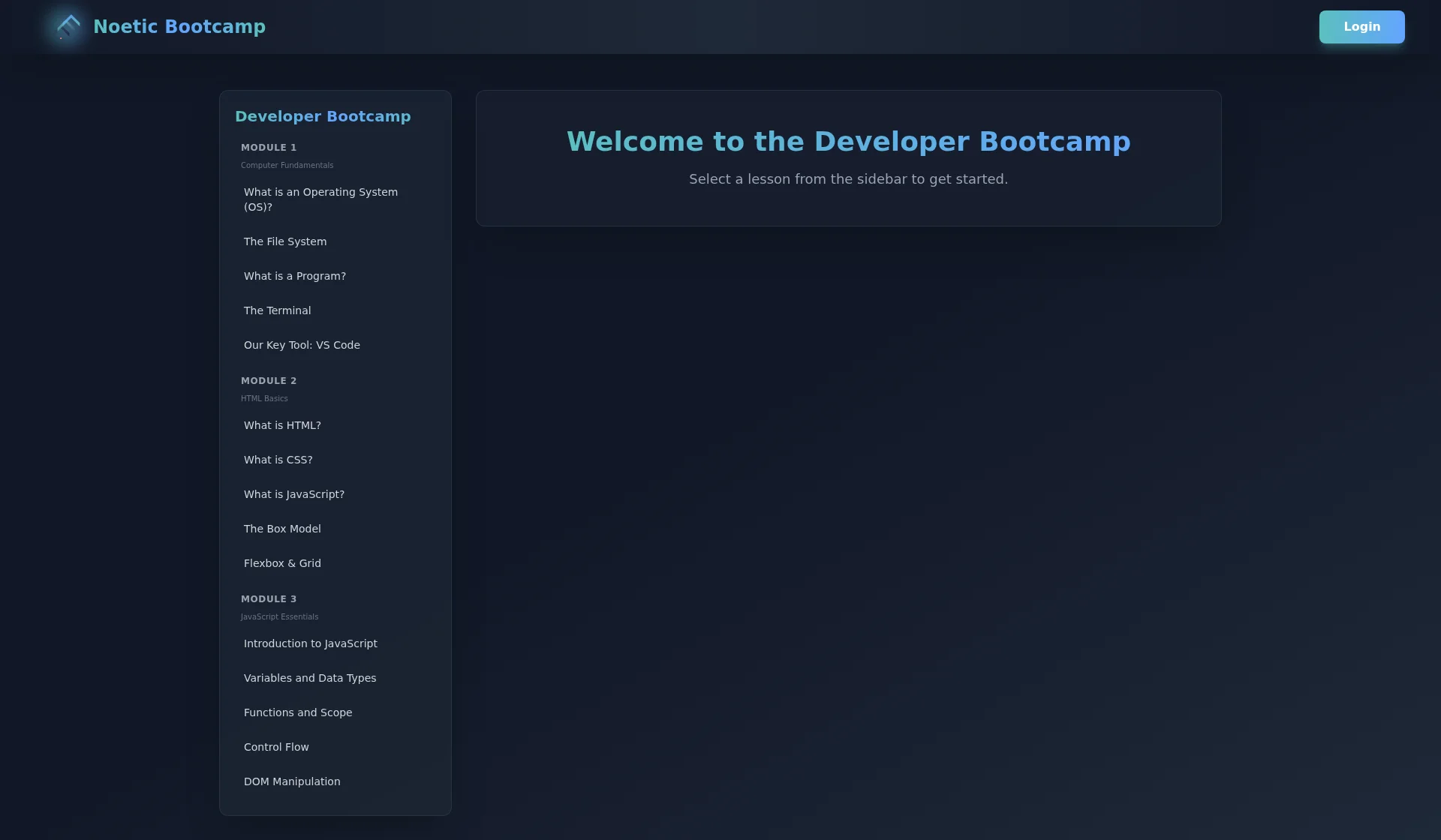
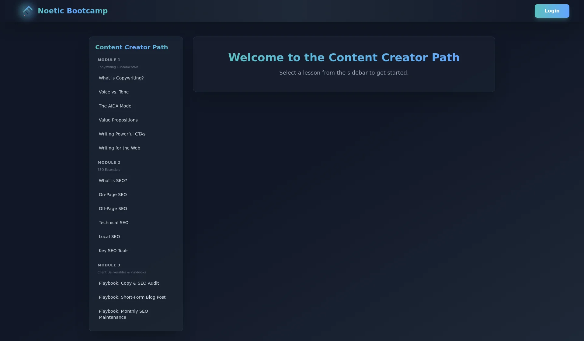
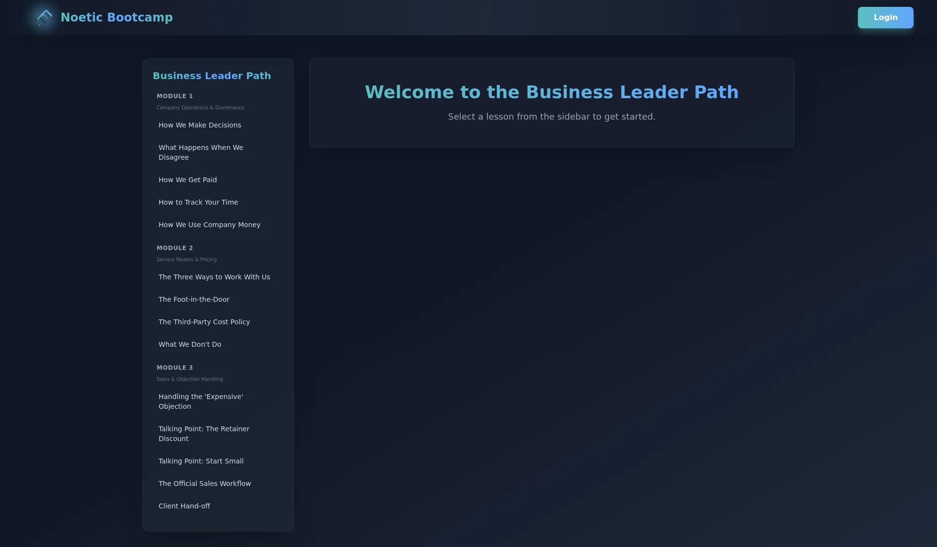
The homepage makes the offer obvious. Supporting pages walk through the curriculum story, the business case for the program, and the login path for people already inside the cohort. Each page has one job. I did not try to cram every argument onto a single scroll.
Copy and layout work together. Headlines say what the section is about. Short blocks of text. Obvious buttons. If someone is scanning on a phone between errands, they should still understand what Noetic does.
What mattered most
Bootcamp sites often sound like they were written for investors, not students. We pushed the language toward plain talk and specific outcomes. The design supports that — calm typography, strong contrast, and screenshots that show the real product instead of stock photos of people pointing at laptops.
The result is a site that feels like a real institution, not a funnel dressed up as education. That was the bar, and we hit it.