I look at a lot of websites. It's part of the job. And over the last few months I've kept running into the same quiet problem.
Good local businesses, ones doing genuinely solid work, have websites that are quietly working against them. Not on purpose. Somewhere along the way they made a choice that seemed reasonable at the time. They hired someone cheap, or trusted a template, or handed it to a person who looked like they knew what they were doing. And now the site is saying something the owner never meant to say.
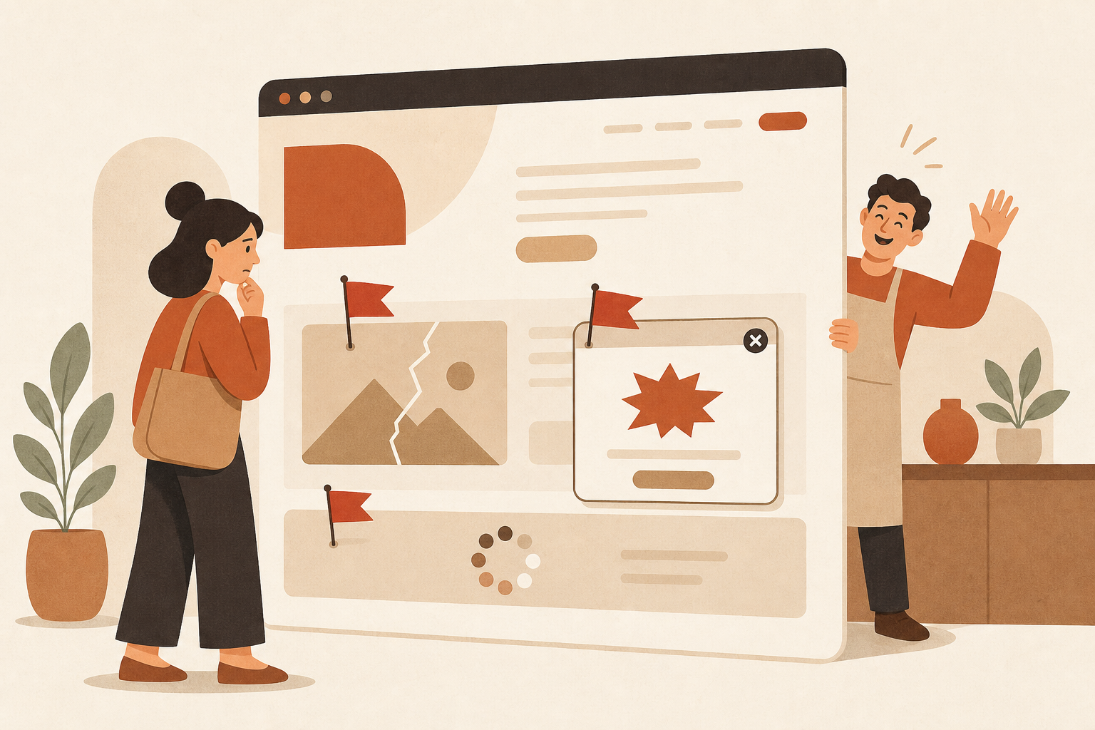
What I keep seeing
Text you can't actually read, because the contrast is wrong. Not "a little hard." Dark gray on dark blue, the kind that makes your eyes work to parse a sentence.
Buttons that don't do anything. Forms that don't submit. Images that just never load, so you sit there waiting on a blank rectangle.
A contact form with someone else's name stamped on the bottom: "Powered by Formstack," "Built with Wufoo." Not your brand. A stranger's.
Pop-ups that fire the instant the page loads. "Contact us!" "Get a quote!" before a visitor has read a single word.
Buttons everywhere, seven of them, each asking for something different, with no clear path through any of it. Just noise.
Copy that's either generic template filler or so thick with jargon that only someone already in the industry could follow it.
I see these and I think the same thing every time: this owner has no idea this is what their customers are walking into.
What a broken detail actually says
When someone lands on your site and immediately hits something that doesn't work, their brain runs a quick, unfair little calculation: if they can't keep their own website working, what are they like to actually hire?
It isn't logical and it isn't fair. It's just real. A broken image isn't only a broken image; it's a signal. A watermarked form isn't only a form; it whispers that you reached for the cheapest option. A contrast problem says nobody looked closely before this went live. Your customers are quietly grading your competence on these little things, and most of the time you never find out they did.
Why it keeps happening
I get why, because the pattern is almost always the same. You hire someone affordable who seems capable enough. They build something that looks okay on the surface. You don't know the field well enough to catch what's missing, so you trust it and publish. Or you grab a template, add your logo, change a few colors, and it looks fine to you, not realizing thousands of other businesses started from the exact same file.
The real issue is simply that you don't know what you don't know. You weren't told that contrast ratios matter, that load time shapes trust, that a pop-up on arrival makes people bounce, that a watermarked form makes you look small. So you assumed whoever you hired knew. And if they didn't fix it, you figured it must not matter. It matters.
The two that get me every time
The pop-up that ambushes you on arrival is the one I see most. A visitor hasn't read a thing yet, and up comes "Get your free quote!" What it really says is, I care more about grabbing your email than about letting you understand what I do. A confident business lets people look around first and reach out when they're ready. Most folks just close the box and leave, decision already made.
The watermarked form is subtler but it stings. When the bottom of your form reads "Powered by" someone else, every person who contacts you is looking at another company's branding at the exact moment they're trying to reach yours. A form that's actually part of your site, that simply feels like it belongs, sends the opposite message.
What this is really about
This isn't about perfection, and it isn't about an expensive website. It's about respect. Broken images tell a visitor you don't respect their experience enough to fix them. Unreadable text says you don't respect their eyes or their time. A pop-up ambush says you don't respect their space. A watermarked form says you cut the corner. Add it up and your website becomes a quiet read on how much you respect the person on the other side, and they tend to sense it within the first few seconds.
Why cheap work can be worse than DIY
Here's something that surprises people. A website you obviously built yourself is often received better than a polished-looking one you paid an amateur for. When you DIY it, people give you the grace of the obvious explanation: oh, the owner did this themselves. But when you clearly hired someone, customers assume you vetted them and checked the result. So when they hit something broken, they don't think you're inexperienced. They think you hired help and didn't even look. What else, they wonder, are they not checking? Cheap work can dent your reputation harder than no work at all.
A quick gut-check
You don't need a huge budget to get this right. Before anything goes live, just walk your own site like a first-time customer and ask:
Can I actually read every bit of text, not "is it pretty," but physically read it?
Do all the images load, and do all the buttons work?
Does my contact form feel like part of my site, or is it wearing someone else's name?
If I were a stranger, would this make me trust the business?
Am I respecting the visitor's time, or ambushing them?
If any of those is a no, the site isn't ready. And if you hired someone and the answer is still no, that's a conversation worth having with them.
The honest version
I've watched genuinely good businesses lose people simply because their website made them look careless. Not because they were careless. They cared a lot. They just didn't know what "right" looked like, so they trusted the wrong tool or the wrong hire, and ended up paying for it in credibility they never saw leave.
Your website should reflect the quality of your work, not quietly undercut it. If it isn't doing that today, it's worth fixing, not in a panic, but soon, because every visitor who leaves with the wrong impression is usually one you won't get a second shot at. And you'll rarely even know they came.